TEUIDA
Don’t just learn Korean, SPEAK it!
TEUIDA is a mobile application (iOS/Android) that provides 1:1 first-person POV lessons and utilizes AI voice recognition technology to help users learn and practice speaking Korean expressions.

Role
UI/UX Designer
Timeline
Jan 2021–March 2022
Design Tools
Adobe CC
Figma
Miro
Sketch
Zeplin
Team
Ji Woong Jang (CEO)
Nelson Cho (Content Manager)
Kwanghee Jeong (Developer)
Introducing Teuida
Learning a language is already hard enough, but having the opportunity to practice speaking is often a bigger challenge. Instead of learning only the technical aspects of a language, Teuida encourages users to practice speaking out and applying their knowledge in context.
Users are graded on their pronunciation for each phrase they learn. Each level in the app represents a storyline, with actors and K-pop stars like Momoland Nancy acting out real-life scenarios in each lesson, making learning a language fun and easy!
The team recently celebrated an important milestone – ranking #1 in Korean language learning apps, #9 in Education in the U.S. App Store & Google Play, and reaching over 700,000 users!
We wanted to see if their method of teaching would be able to be effective in another language, and after surveying users to see where the demand lay, Teuida decided to create a Japanese beta version.
What I Did
• Design and development of the Japanese beta version for both Android & iOS
• Created interactive click-through prototypes in Figma
• Transferred deliverables through Zeplin
• Collaborated with the CEO & developers to implement designs and make iterations
Main Takeaways
1. Guiding users from the Korean version to the Japanese version
2. Distinguishing Premium users from Free users
3. Seeking feedback to gauge the effectiveness of the Japanese beta version
1.
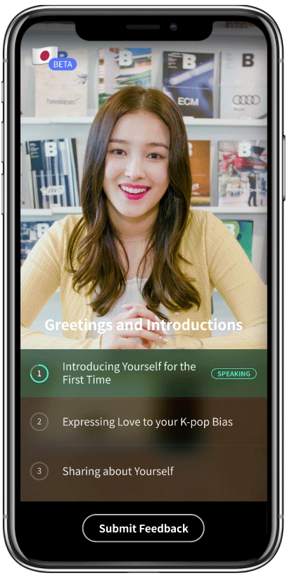
How might we guide users from the home page of the Korean version to try out the Japanese beta?
The current version of Teuida only offers learning Korean, so our question was, after we inform users of our beta version, how can we make it intuitive for them to switch between the 2 versions? I decided to incorporate flags as a clear visual of the different languages, and a mini drop-down menu that showcases both the Korean premium and Japanese beta.
Japanese Beta in Figma formatted for both iOS & Android
2.
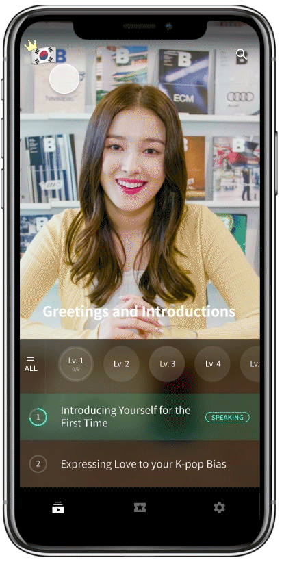
How can we distinguish Premium from Free users on the Home Page?
While designing the new version, I had to decide how to distinguish Premium users from regular users. The Premium icon was on the top left, but that would be replaced with the drop-down language selection menu. By placing the crown on top of the flag, it would clearly indicate the user is a Premium user through visuals.

Korean only version

Korean + Japanese Beta
3.
How can we encourage users to share their feedback after testing out the Japanese beta?
As this is a beta version, we wanted to test out if our teaching method works well for other languages besides Korean. As the beta version only has one level instead of multiple like the Korean version, I replaced the menu bar with a Submit Feedback button. This would be activated after the user has completed as least one chapter of the Japanese beta level. In addition, a notification would pop-up, directing the user to the Typeform survey embedded in the mobile app.
The survey will also be helpful in not only gauging the interest of Teuida’s language teaching method in other languages, but also allow us to conduct brief UX user research.


Next Steps
Launched in May 2021!
Additional Updates

How might we guide language learners to study even more and complete more lessons?
While we surpassed 500,000 users through the Japanese beta updates, after speaking with many of our users, we realized that not many of them knew that we had both conversations (lessons with 1:1 dialogue with actors) as well as lesson videos (learning to pronounce individual phrases with a tutor). To drive users to not only ‘Slide to Speak’ to start a conversation, after they have completed at least one conversation, I designed an animation to highlight the lesson videos. This indicator helps drive users attention to it, making them aware that there are lesson videos to practice after finishing the conversations.
Through this update, we were able to see an increase in user activity with the lesson videos, as well as significantly more sessions completed in a day.